As an Uber driver, I’ve found that mastering the heat map is key to boosting my earnings. The heat map is a powerful tool that shows where demand is high. It helps drivers make more money by driving during peak times and when prices surge. This article will cover the basics of the Uber heat map, how to read it, and tips to make more money.
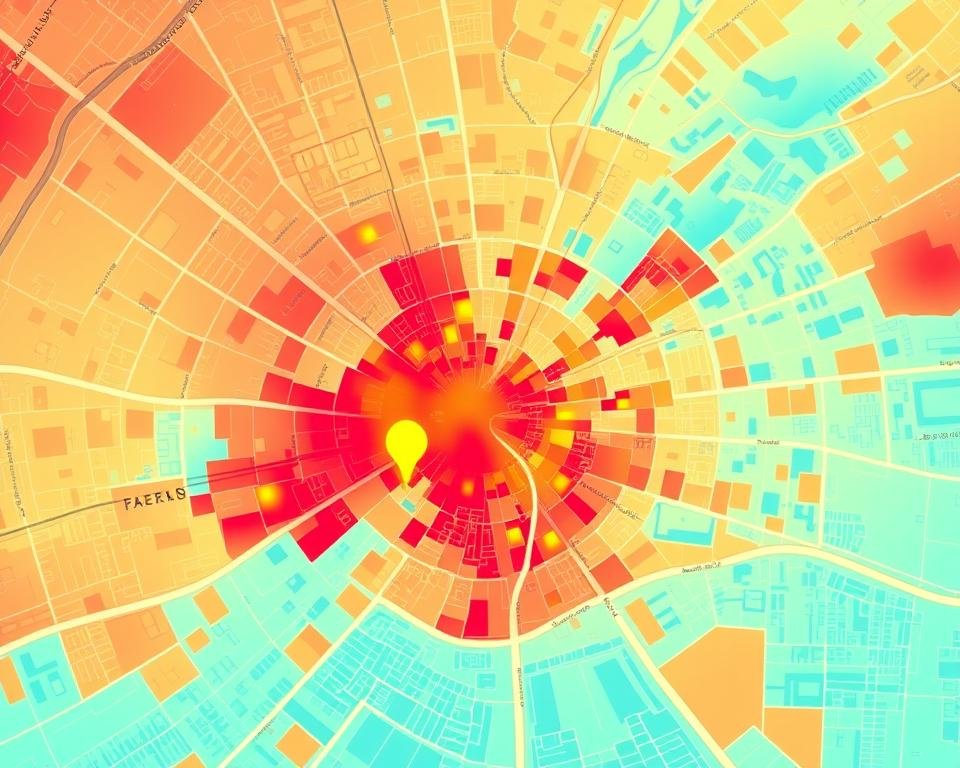
The Uber heat map is a great tool for drivers. It uses colors to show demand levels, with darker tones meaning more demand. By using this map, I can find busy areas and plan my drives better. For example, late nights on weekends and Sundays in the morning are great times to earn more in London.
Understanding the Uber driver heat map helps me make better choices about when and where to drive. This knowledge boosts my earnings and makes me a better Uber driver. The heat map shows demand in real-time, helping drivers adjust their plans to earn more.
Key Takeaways
- Mastering the Uber heat map feature can increase income
- The heat map shows demand levels with darker tones indicating higher demand
- Peak hours, such as late-night weekends, can lead to higher earnings
- Understanding the Uber heat map can help drivers make informed decisions about when and where to drive
- The heat map feature offers drivers flexibility in selecting rides according to their preferences and revenue goals
- Surge pricing occurs when demand for rides is high, leading to higher fare charges
- Drivers can maximize revenue by choosing rides in high-demand areas or opting for less busy locations
By following the tips in this article, Uber drivers can earn more and succeed. Whether you’re new or experienced, knowing the Uber heat map is vital. So, why not become an Uber driver today and use the heat map to your advantage? You can sign up at: https://drivers.uber.com/i/amq9pwb8pck4
What Is Uber’s Heat Map and Why It Matters
As an Uber driver, knowing about the Heat map for Uber drivers is key to earning more. The Uber drivers heat map shows where people want rides, using colors to show demand. With the Uber GPS heat map, you can choose the best places and times to drive for more fares.
The heat map changes as it happens, giving you the latest on demand. This lets you plan your drive better, heading to busy spots or skipping quiet ones. Using the heat map helps you make the most of your time and boost your earnings.
Here are some main benefits of the Uber GPS heat map:
- Real-time demand visualization
- Optimized driving strategy
- Increased earnings
Learning about the heat map can improve your driving and earnings. It’s a must-have for all drivers, new or experienced.
How Does Uber’s Heat Map Work for Drivers?
As an Uber driver, knowing the Uber location heat map is key to earning more. The heat map shows where rides are needed most. This lets you plan your drive to make more money.
The Uber driver location data updates fast. This means you always know where to go and when to rest. With the heat map, you can:
- Find busy spots and change your drive plan
- Earn more by heading to busy areas
- Make smart choices about your route
To start with the heat map, open the Uber driver app and go to the map view. You’ll see where rides are needed. Use the Uber location heat map and Uber driver location data to boost your earnings.
Follow these tips and use the heat map wisely. This way, you can earn more and be a top Uber driver. If you’re new, sign up here: https://drivers.uber.com/i/amq9pwb8pck4
| City | Heat Map Availability |
|---|---|
| London | Available |
| San Francisco | Available |
| Paris | Available |
Interpreting Colour Codes and Surge Pricing

As an Uber driver, it’s key to know the colour codes and surge pricing on the heat map. This helps you earn more. The heat map shows demand levels with colours, with darker shades meaning more demand. Knowing this helps you choose the best times and places to drive.
Understanding the colours and pricing is essential. For example, light blue means low demand, while dark red means high demand with surge pricing. You can find more tips on summer driving and boosting your earnings as a PCO driver.
Here are some important points to remember:
- Know how different shades relate to pricing
- Find high-demand areas with surge pricing to earn more
- Use the heat map to plan your route and cut downtime
By grasping the colours and surge pricing, you can boost your earnings. Uber driver route optimization is vital, and the heat map is a great tool. If you’re new, sign up here: https://drivers.uber.com/i/amq9pwb8pck4
Success as an Uber driver comes from staying informed and adapting to demand. The heat map helps you navigate and increase earnings. It’s a powerful tool for drivers.
| Colour Code | Demand Level | Surge Pricing |
|---|---|---|
| Light Blue | Low | No |
| Dark Red | High | Yes |
Accessing the Heat Map Feature in Your Driver App
To find the Uber heat map in your driver app, open the app and go to the map view. The heat map shows where there’s a lot of demand for rides. By using the heat map for Uber drivers, you can spot busy areas and plan your routes better.
The Uber Driver app updates every few minutes. This keeps the Uber heat map fresh, giving you the latest on ride demand. You can use this info to earn more and spend less time waiting.
Here are some important tips for using the heat map for Uber drivers:
* Local data should refresh more than every 10-15 minutes
* Riders have 2 minutes to accept their ride at the surge level shown when they open the app
* The Uber app updates every few minutes to limit data exchange
By following these tips and using the Uber heat map well, you can boost your earnings. If you’re new to Uber, sign up to drive here: https://drivers.uber.com/i/amq9pwb8pck4
Key Components of Uber’s Heat Map Interface
As an Uber driver, knowing the heat map interface well is key to earning more. The Uber GPS and location heat maps show where there’s a high demand for rides. This helps you decide where to go next.
The interface has controls for navigating, time stamps, and updates. It also shows zone boundaries. These are vital for moving around the map and finding busy spots.
Navigation Controls
The navigation controls let you zoom in and out, and move the map. This is great for spotting busy areas and planning your route. Using the heat maps, you can make your driving more efficient and earn more.
Time Stamps and Updates
Time stamps and updates tell you when the map was last updated. This ensures you have the latest info on demand. It’s important for deciding where to go and when to change your route.
Zone Boundaries
Zone boundaries are key to the heat map. They help you find busy areas and plan your route. By understanding these boundaries and using the heat maps, you can earn more and serve your passengers better. If you want to drive for Uber, sign up at https://drivers.uber.com/i/amq9pwb8pck4.
Maximising Earnings with Heat Map Data

As an Uber driver, I’ve found the heat map feature key for boosting earnings. It shows How does Uber’s heat map work for drivers and helps plan your routes. This real-time data lets you pick the best times and places to drive.
Here are some tips to make more money:
- Drive during busy times like rush hour or late at night
- Choose the best times to drive to avoid traffic and downtime
- Take advantage of surge pricing to earn more during busy times
- Give great service to get more tips and better ratings
The heat map also helps with Uber driver route optimization. It shows you where to go to find more passengers. This means less time driving around looking for rides.
It also helps decide between busy but congested spots and quieter areas. This can make you more money and help you balance work and life. Uber’s flexible work options through the heat map improve the job for drivers and the service for customers.
| City | Average Earnings per Week |
|---|---|
| London | £250-£800 |
| Manchester | £200-£600 |
| Birmingham | £150-£400 |
By using these tips and the heat map, you can earn more and succeed as an Uber driver. Sign up to be an Uber driver today and start earning: https://drivers.uber.com/i/amq9pwb8pck4
Common Heat Map Patterns in UK Cities
If you drive for Uber in the UK, knowing about heat map patterns can boost your earnings. The Uber heat map highlights busy areas, helping you plan your routes better. In London, for instance, demand spikes during rush hours and weekends.
In Manchester and Birmingham, demand is more evenly spread across the city. This means you can find busy spots to earn more. The Heat map for Uber drivers is key for improving your earnings.
Here are some common heat map patterns in UK cities:
- High demand during peak hours like rush hour and weekends.
- Manchester and Birmingham: Demand is spread out across the city.
- Edinburgh and Glasgow: Busy in city centers and areas with lots of people.
Using the Uber heat map helps you decide where and when to drive. This can increase your earnings. If you want to drive for Uber, sign up here: https://drivers.uber.com/i/amq9pwb8pck4
| City | Peak Hours | Average Earnings |
|---|---|---|
| London | Rush hour, weekends | £20-£30 per hour |
| Manchester | Evenings, weekends | £15-£25 per hour |
| Birmingham | Afternoons, evenings | £10-£20 per hour |
Strategic Positioning Using Heat Maps
As an Uber driver, making more money is key to your success. Using Uber’s heat map feature can help. It lets you see where there’s a lot of demand. This way, you can plan your drives better.
The Uber location heat map shows you where people need rides. This helps you decide where to go. It’s all about making smart choices based on real-time data.
Here are some tips for using the heat map well:
- Find busy areas and drive there to earn more.
- Watch for surge pricing on the heat map. Plan your drives to make the most of it.
- Keep an eye on the heat map to stay ahead of other drivers.
By using the heat map, you can earn more and do better as an Uber driver. Always check the Uber location heat map to know where to go. This way, you’ll make the most of your time driving.
Sign up to be an Uber driver today and start using strategic positioning to maximize your earnings: https://drivers.uber.com/i/amq9pwb8pck4
Understanding Seasonal Heat Map Variations

As an Uber driver, knowing how seasonal changes affect your earnings is key. The Uber heat map is a great tool for spotting where demand is high. It helps you plan your routes better to make more money.
The Heat map for Uber drivers changes a lot during holidays. For instance, Christmas and New Year’s Eve see a lot of demand in places with fun activities. Events like concerts and festivals also draw people to specific spots.
Here are some important things to think about when looking at seasonal heat map changes:
- Holiday periods: High demand in areas with popular entertainment venues
- Special events: Concentrated demand around the event location
- Weather: Inclement weather can impact demand, with more passengers seeking rides during rainy or snowy conditions
By understanding these changes, you can improve your driving strategy. This way, you can earn more and give better service. Whether you’re new or experienced, the Uber heat map and Heat map for Uber drivers are useful tools.
| Seasonal Event | Heat Map Variation |
|---|---|
| Holiday Periods | High demand in areas with popular entertainment venues |
| Special Events | Concentrated demand around the event location |
| Weather | Inclement weather can impact demand, with more passengers seeking rides during rainy or snowy conditions |
Heat Map Analysis for Different Times of Day
As an Uber driver, it’s key to know how to use the heat map at different times. This helps you find busy areas and plan your route better. Uber driver route optimization is all about making the most of your time driving.
The heat map shows where Uber rides are most in demand. It updates in real-time. By looking at it, you can see where to go to find more rides. This is vital during busy times like rush hour and weekends.
Here are some tips for using the heat map at different times:
- Use the heat map to find busy areas during peak hours
- Change your route to match demand in those spots
- Learn about How does Uber’s heat map work for drivers to make better choices
By using these tips and the heat map, you can earn more and be a better Uber driver. Always watch the heat map and change your plan as needed to stay on top.
For more info on starting with Uber, visit https://drivers.uber.com/i/amq9pwb8pck4
| Time of Day | Demand Level | Strategy |
|---|---|---|
| Peak Hours (7-9 am, 4-6 pm) | High | Focus on high-demand areas |
| Off-Peak Hours (10 am-3 pm) | Medium | Adjust route to meet medium demand |
| Late Night (10 pm-1 am) | Low | Focus on low-demand areas with surge pricing chance |
Combining Heat Maps with Other Uber Driver Tools
As an Uber driver, I’ve found that using heat maps with other tools boosts my earnings. The Uber GPS and location heat maps show where rides are needed most. This helps me navigate to busy spots, raising my chances of earning more.
Here are some benefits of using heat maps with other tools:
- Increased earnings: I can find busy areas and earn more fares.
- Improved navigation: Heat maps guide me to high-demand spots with ease.
- Enhanced driver experience: I can plan my route better, making driving more efficient and fun.
To start using these tools, sign up to be an Uber driver here: https://drivers.uber.com/i/amq9pwb8pck4. With the right tools, I can earn more and succeed as an Uber driver.
Troubleshooting Heat Map Display Issues
As an Uber driver, you need the Uber heat map to find busy areas and earn more. But sometimes, the heat map doesn’t show up right. This makes it hard to make good choices. We’ll look at common problems and how to fix them quickly.
Problems like app issues, internet problems, and device not working right can cause trouble. Here’s what you can do:
- Restarting the app
- Checking your internet connection
- Ensuring your device is compatible with the latest version of the Uber Driver app
Try these fixes to solve your heat map problems. Always keep your app and device updated. This way, you get the newest features, including the Heat map for Uber drivers.
For more help, check the Uber support website or talk to their customer support. Being informed and proactive helps your Uber heat map work right. This gives you the info you need to find busy spots.
Advanced Heat Map Strategies for Experienced Drivers
If you’re an experienced Uber driver, you know the basics of the heat map. It helps you earn more. But, to really boost your earnings, you need to learn advanced strategies. Uber driver route optimization is key to getting more rides and making more money.
Look at the heat map patterns to find high-demand areas. This way, you can be in the right place at the right time. It also helps you avoid low-demand areas, so you don’t wait too long for a ride.
Using the heat map with other tools like navigation systems and surge pricing can help too. These tools give you a clearer picture of where rides are needed. Sign up to become an Uber driver and start using these strategies to earn more.
Here are some important tips for using the heat map:
- Know how the heat map works and what the colors mean
- Find high-demand areas and position yourself there
- Combine the heat map with other tools to earn more
By using these advanced strategies, you can improve your Uber driving and earn more. Always keep up with heat map updates. And remember to use it with other tools to succeed.
Privacy and Data Usage Considerations
As an Uber driver, it’s key to know how your location data is used. This data helps create the Uber location heat map. The map shows where there’s a lot of demand, helping you earn more. But, you might wonder how your data is collected and used.
The Uber location heat map keeps your privacy safe. It uses anonymous data only for the map. You can find out more about Uber’s privacy efforts on their website. There, you’ll see their latest updates.
Some important features of the Uber location heat map include:
- Real-time demand visualization
- Anonymized data collection
- Enhanced driver safety and convenience
Knowing how your data is used makes you feel secure. If you want to learn more about using the map to boost your earnings, sign up at https://drivers.uber.com/i/amq9pwb8pck4.
| Feature | Description |
|---|---|
| Real-time demand visualization | Shows areas of high demand in real-time |
| Anonymized data collection | Protects driver privacy by collecting data anonymously |
| Enhanced driver safety and convenience | Provides features such as Record My Ride and verification of rider identities |
Future Updates and Improvements to Uber’s Heat Map
Uber is always improving its Uber heat map feature. This helps drivers earn more by giving them the latest info. The Heat map for Uber drivers is key, and it’s getting better all the time.
New features and updates are coming soon. Drivers will get better navigation and surge pricing info. This will help them decide where and when to drive. The heat map will also be more accurate, showing demand clearly.
Uber is dedicated to making the Uber heat map better for drivers. By keeping up with updates, drivers can use the Heat map for Uber drivers to its best. These changes will make the Uber heat map even more vital for drivers’ success.
Here’s what’s coming:
- Improved navigation and surge pricing overlay features
- Enhanced accuracy and reliability of the heat map
- New features to support driver earnings and success
Conclusion: Mastering the Heat Map for Better Earnings
The Uber heat map is a key tool for drivers to improve their routes and earnings. It helps drivers understand the map’s colours and how to position themselves. This way, they can beat the competition and earn more.
It’s important to keep an eye on the heat map and notice patterns. By using it with other tools, like navigation and surge pricing, drivers can see where rides are needed. This helps them decide the best times and places to drive.
Getting good at using the Uber heat map takes time and practice. The more you use it, the better you’ll get at using its data. Stay alert, flexible, and focused on your goals. This will help you earn more with Uber.
FAQ
What is Uber’s heat map and why is it important for drivers?
Uber’s heat map shows where rides are needed most. It uses colours to show demand levels. Drivers can earn more by going to busy areas.
How does the heat map work for Uber drivers?
The heat map shows where rides are needed in real-time. It’s in the Uber driver app. Drivers can find busy spots to earn more.
How can drivers interpret the colour codes and surge pricing displayed on the heat map?
The heat map uses colours to show demand. Darker colours mean more demand. Drivers can find busy spots to earn more.
How can drivers access the heat map feature in the Uber driver app?
The heat map is in the Uber driver app. Just go to the map view to see it. It shows where rides are needed.
What are the key components of the Uber heat map interface?
The interface has controls, time stamps, and zone boundaries. Controls let drivers zoom and move the map. Time stamps show when the map was updated.
How can drivers use the heat map data to maximise their earnings?
Drivers can find busy spots with the heat map. They can earn more by going there. It also helps them find rides faster.
How do common heat map patterns vary across different UK cities?
Heat map patterns change by city and time. London is busier during rush hour. Manchester and Birmingham have demand all over. Drivers can earn more by knowing these patterns.
How can drivers use strategic positioning with the heat map to increase their earnings?
Drivers can find busy spots with the heat map. They can earn more by going there. It’s good to be near landmarks or events.
How can drivers troubleshoot heat map display issues in the Uber driver app?
If the heat map doesn’t work, try restarting the app. Check your internet too. If it doesn’t work, contact Uber support.